Background
Timeline: 2 months (2019)
My role: UX/UI Designer & Researcher
Tools: Adobe XD, Fullstory
While working at Omega in 2019, we discovered the need for a more intuitive way to customize devices. With the new update in early 2019, users were experiencing a much more up to date website and thus expected more new features. With thousands of items with even more specifications available for customers to sort through, the past way - emailing or including each individual specification in the "notes" section of the checkout - just wasn't cutting it.
Finding the devices to customize was an issue as well, as the search results pages needed an update as well.

Redesigning Search
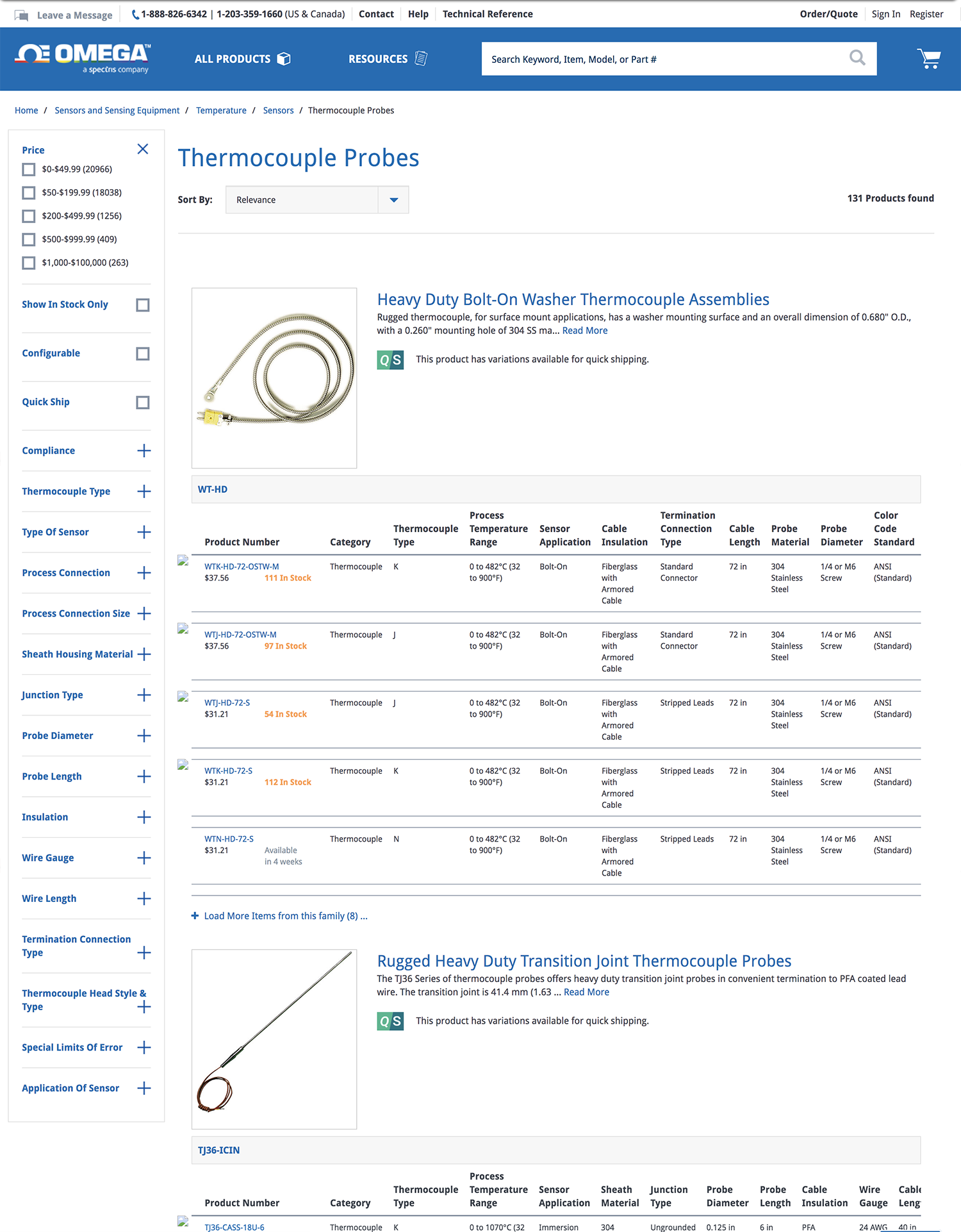
Creating a clean, informative, and painless system for viewing the product before diving in to configure a device to the users' needs was on the top of the list for this project. We had received feedback that the current search system was too much information all at once, with tables that sometimes spanned over 100 options under the fold. Additionally, only one product was viewable at a time. Even though a lot of content was available at a glance, it would be better suited to dive down into the specifics on the device's page, since users had reported that the search was clunky and tiring to scroll through.
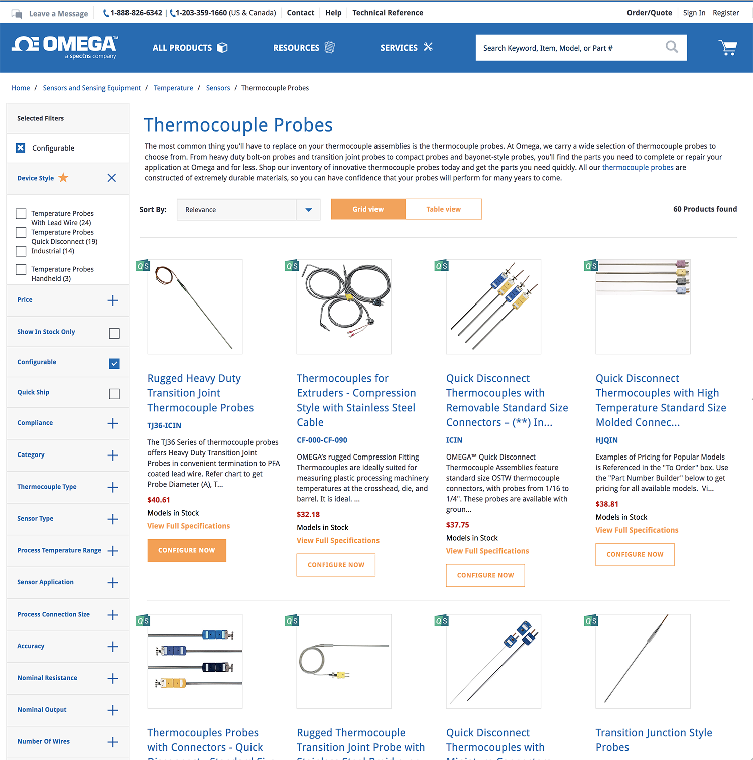
A toggle to switch back to the table view was included if the user wanted, but by default showed 4 products per row. Each had the name, SKU number, a brief, or cut-down summary, plus the price, stock, and a link to view the full specifications on the product's page. On customizable products, the Configure Now button was added, and the modal pops up.
Finished Search and Feedback
The new search showcased all the necessary information without all the unnecessary space. I refined the filters bar with a little more color hierarchy to more clearly show which sections are open and which are not, and include a section to show which filters are already selected.
With the regular search recieving positive feedback from users, we moved forward towards the modal itself. A section that could encapsulate the hundreds of details in an easy to use and quicker approach than the then current user's experience, which was scrolling through tables and writing down the exact specifics before ordering the piece with the specific number that lines up with the user's combination of specs.
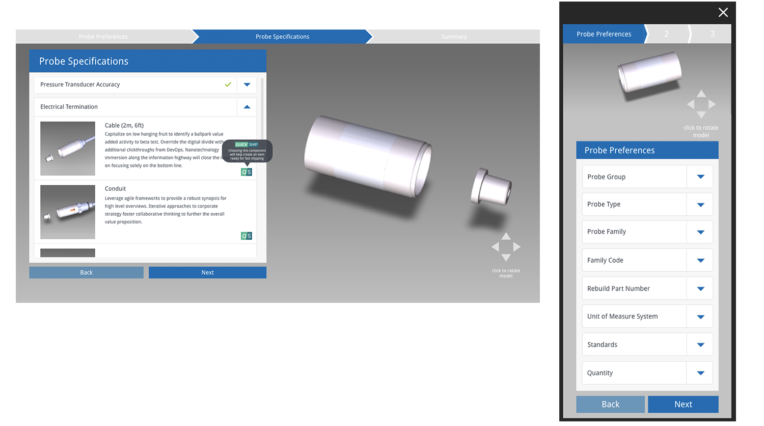
Creating the Modal
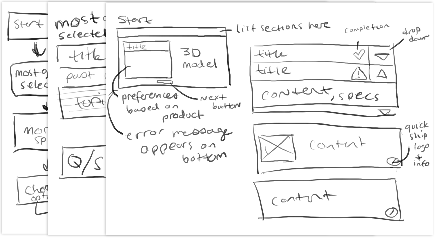
This project wasn't started from scratch: we had the 3D model section created and it wasn't too flexible with background, so we had to work around it. Figuring out the flow, interface, and details was the bulk of the project. I sketched out several wireframes and element details before fleshing them out in Adobe XD and eventually making a working prototype in the same program.
Completing the Design
The new modal takes the user through a specific journey: they walk through the more general points of a device before dialing down the specifics. Users are told along the way if their choices match up with the past selections, but this only occurs when they go back and select a different choice than before. While going through it without flipping around, there won't be any options that aren't compatible with eachh other, so no devices will be disfunctional or need a ton of reworking. The modal, as it's featured on the website, is also responsive.