Background
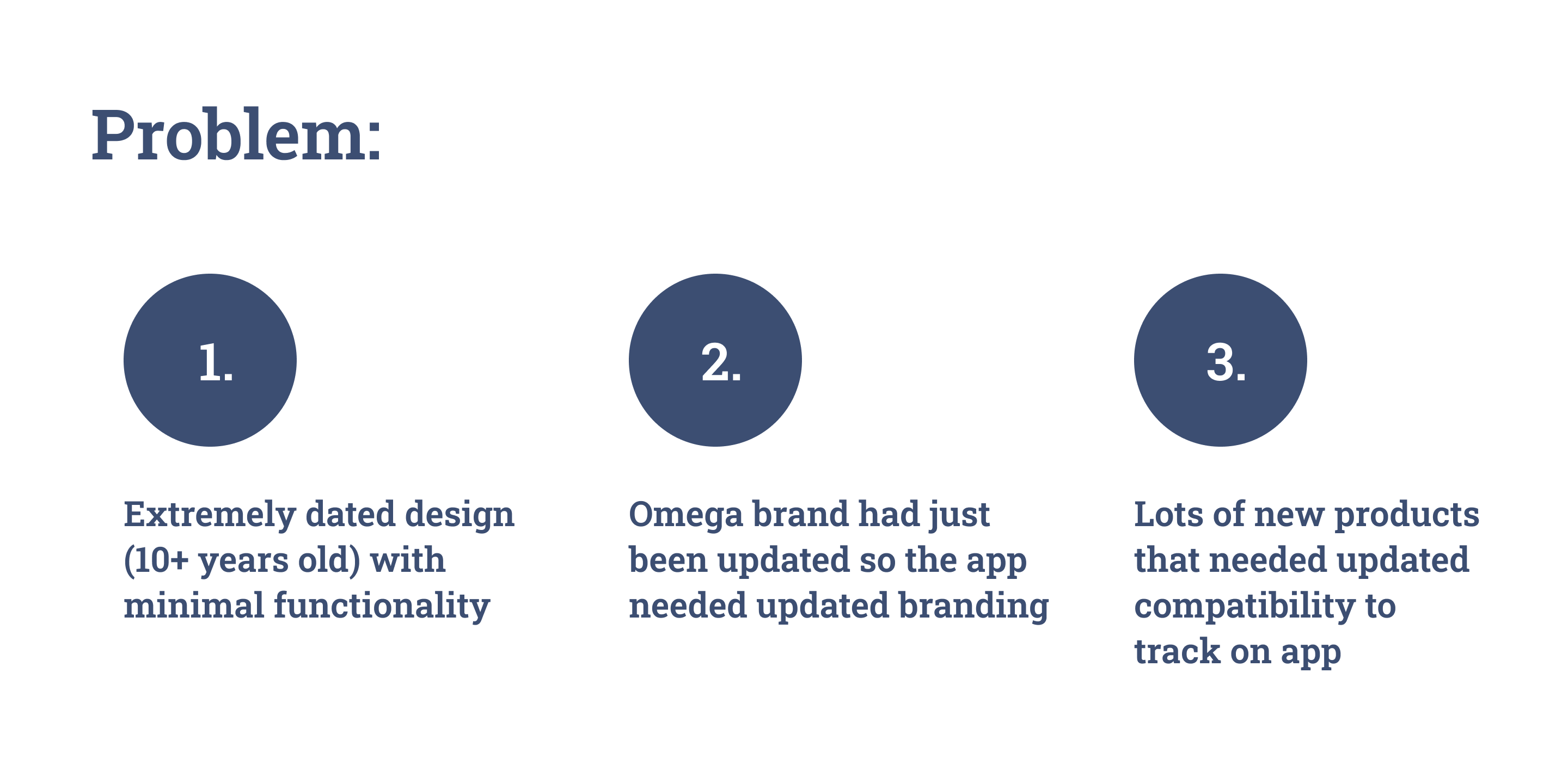
The OEG app, or Omega Enterprise Gateway, is an app to link Omega Engineering's many devices and tech to one app and monitor all the collected data at once. The original app had last been updated years before, about 10 years before in 2008, and was in great need for an upgrade. This new version would need a lot of research and a new UI to match the (at the time) newly updated Omega website and branding.
Timeline: 3 months (2018-2019)
My role: UX/UI Designer
Tools: Adobe XD, Zeplin
Timeline
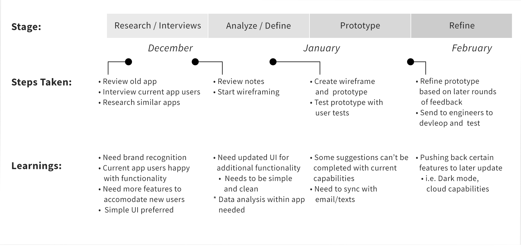
For the design and research phase, we were only given about three months to define the problem and create solutions to make the new app a much more robust and functional experience for the users. First, we had to figure out how much time was enough to figure out what to do with the app, design it, and test it. Since we wanted to incorporate User Interviews and get actual users of the app to help us understand what they wanted, we dedicated almost the entire full month to setting up interviews and meeting with the users. The second and third months were split between reviewing and revising the wireframes and prototypes and testing them with users to see how they liked the design.

Click to view full image
Collecting Data
To start off, we checked out what the old app looked like. It was only available for the web, and appeared like a basic HTML table with a cyan-ish background. The only other color was red, for when a device had an issue that needed attention. As it was, there were no brand colors, no Omega logo. There was minimal data and each device could only read for one measurement type at a time. Additionally, most of the device information could only be changed by accessing the physical device and changing the info there. Below is an image of the app before the redesign.
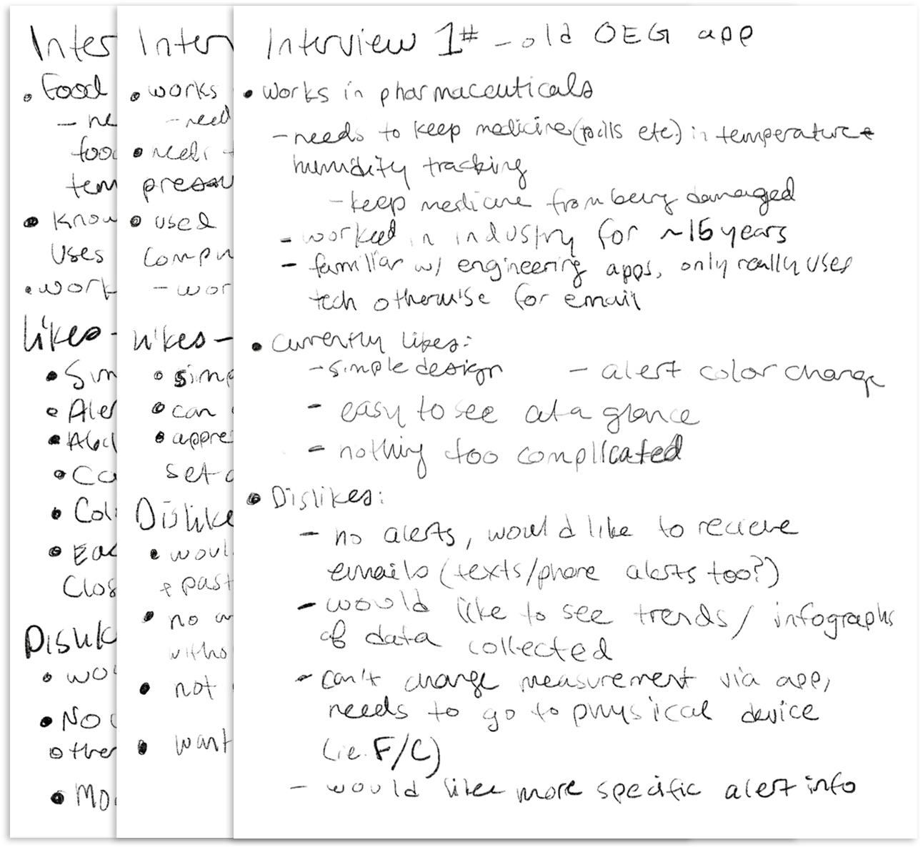
To collect information on what the users wanted, we started by reached out to several long term customers. Quite a few were users of the OEG app and volunteered to walk us through how they used it, what they liked and didn’t like, and what they would like for an updated app. Additionally, we asked them about why they were using the app, their proficiency with different technology, which industry they worked in and how long they had been in the industry. We scheduled the first round in early december and interviewed around 10 different users from a variety of industries and used the information we gathered to help inform the first rounds of prototypes.
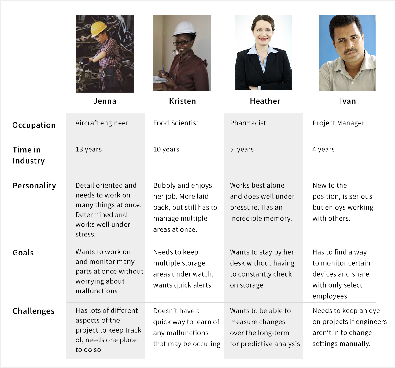
Personas
To help understand the users better and compile the data, we created four personas. Three were actively needing to monitor some sort of measurement that was critical for their position, and one was managing engineers who would be monitoring and needing varying levels of access to the device measurements. The personas were pretty heavily based on the research we did, so many of the details were informed by real people. However, creating how they interacted with the app and refining their goals and challenges to better understand exactly what users wanted was essential.
Prototyping
The prototype went through many iterations before the final version. The first few versions had much more information and was narrowed down due to user feedback. We ran about 5 rounds of user tests when the prototype was in a good place. Users would click through and look at the mocked up data and do their best to narrate their thought process through it. We tried to make it as realistic as possible to reflect how it might actually look when it’s up and running. Through the prototype reviews, we gained a lot of insight on how to move forward for future versions such as adding a dark mode and potentially linking up the devices to a cloud server.
Final
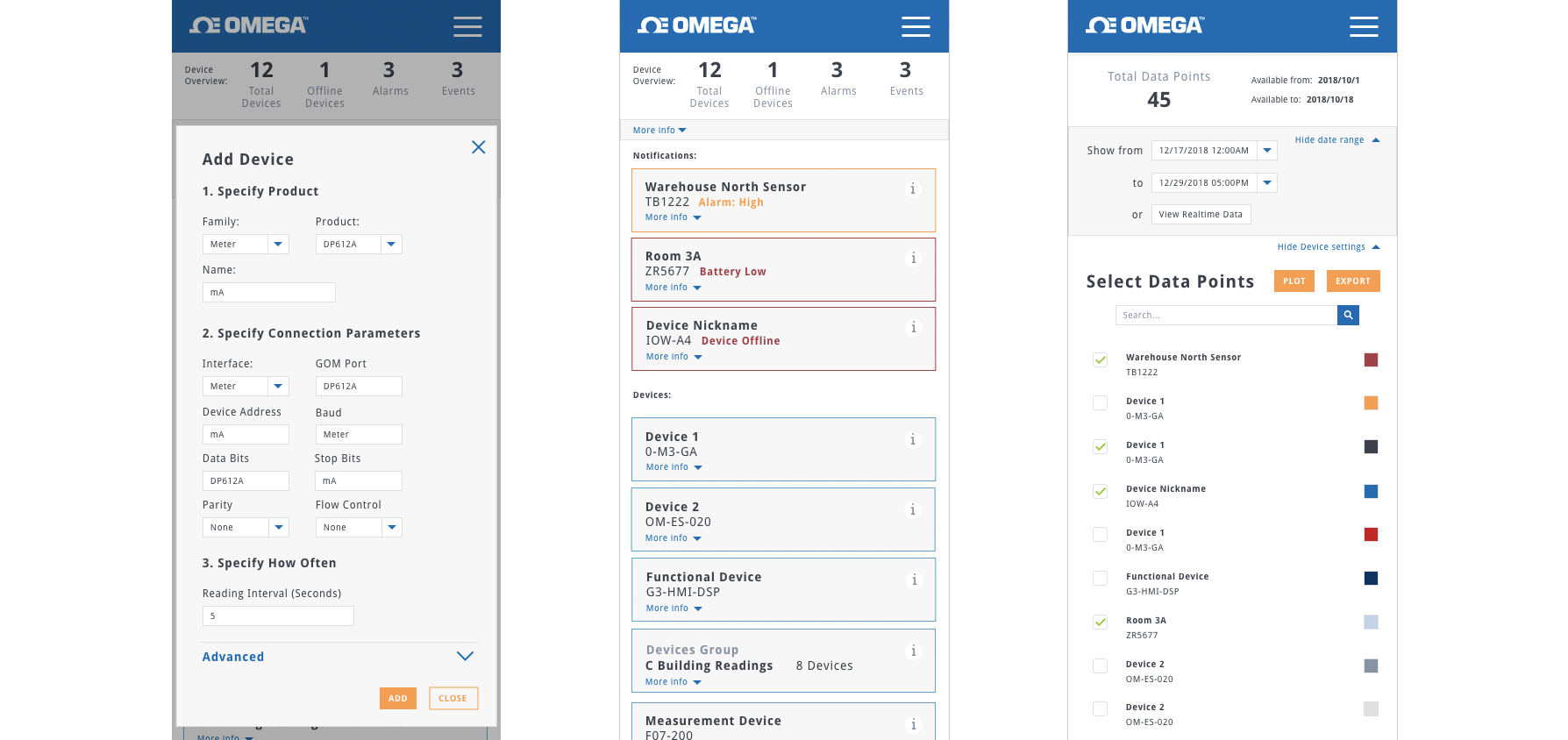
After many, many iterations, we felt the prototype was in a good place for development and send it over to be developed. For my portfolio use though, since it was pushed back to a later version, I prototyped a mobile version as well. It was also a fun exercise in mobile design.
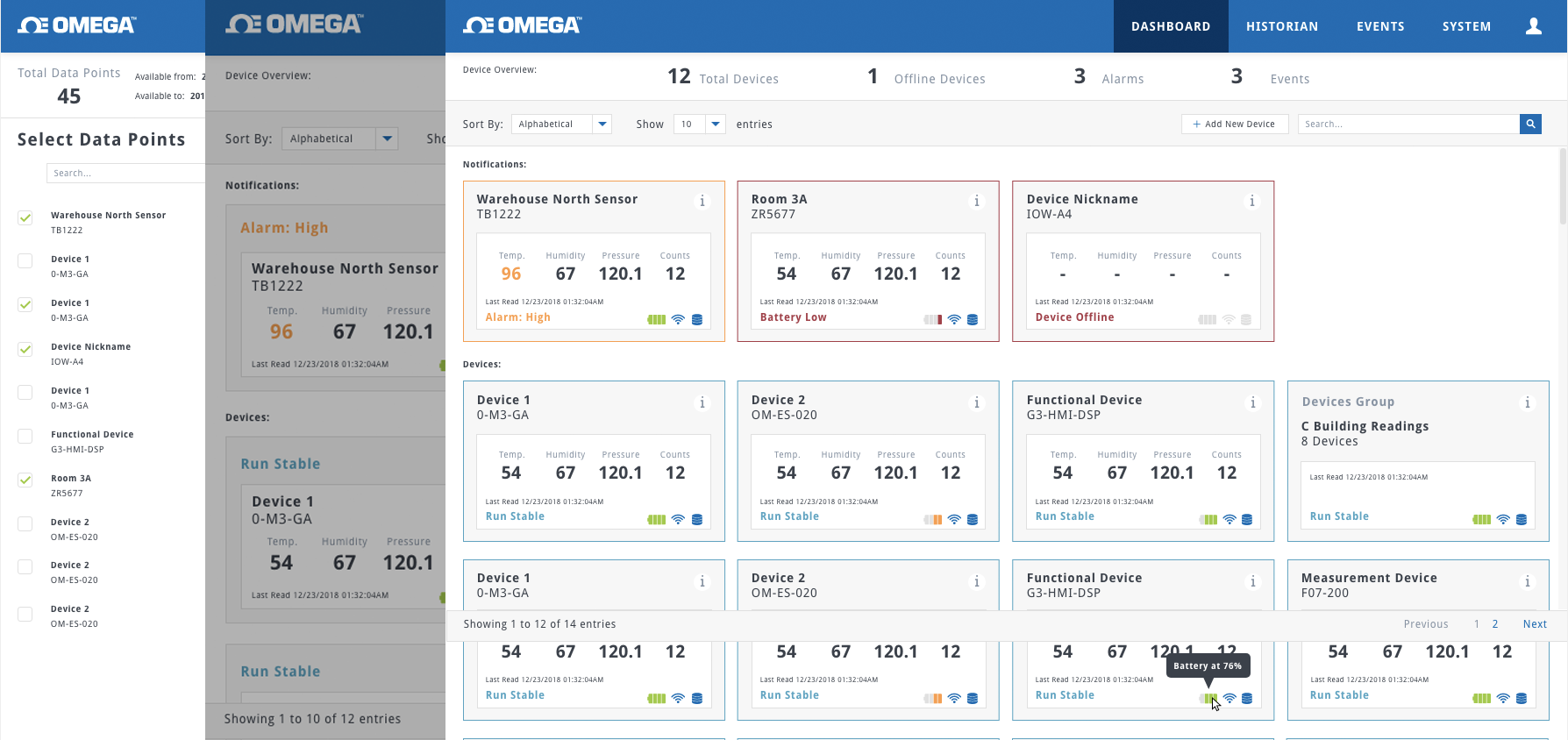
We added many new features to the app. Each device “block” displayed the device’s name, SKU number, and the temperature readings for whichever measurements were set. Alerts would be pushed to the top, as some users had tens of devices hooked up and couldn’t afford to scroll if something went wrong. Clicking in would show more detailed device data, along with the option to change the device information. Devices could also be grouped. Additionally, a Historian tab was added to let users see past collected data. The system settings gave users the option to change measurement systems, servers, and many other things that were impossible with the old app. It became much more detailed and users reported it as being a great upgrade.