Background
Timeline: 7 months (2024)
Team: Christine St. Pierre (Product Owner), BJ Collins (Front-end Developer), Rory Gibson (Back-end developer)
My role: Senior Product Designer & Researcher
Tools: Figma, Figjam, Testmo, Pendo
When a user first joins a program, there’s often an introductory period where users are asked to look around and get acclimated to the different features and functionality - this is often called onboarding. At Community Company (CCO), the previous onboarding process was disjointed and asked the user to complete a large variety of tasks before they could even get started with their new membership.
The previous onboarding flow started after the user applied to join a community. The process would typically go like this: A user would want to join a community through one of our clients such as Forbes, Rolling Stone, or Fast Company. They would then submit an application, the Sales team at CCO would then run a background check and make sure the potential new user met all the needed credentials, and then the user would receive an email asking for their payment information so they could purchase a subscription and get started in their new community. After paying for their subscription, the user would then be asked to answer three Expert Panel questions - answers that would be submitted to be chosen for collaborative articles, a major benefit for users - and then answer 6 in-depth questions about topics such as why they were joining, what they wanted to get out of their membership, and what their job background and experience were like. Finally, after all of those tasks, the new user would then be allowed to enter the community and get started writing articles and networking with their peers.
The previous user flow was extremely intensive for new users. Without giving them the opportunity to learn at their own pace, users were thrown into multiple tasks that required a lot of time and effort, some of which they weren’t even familiar with, such as Expert Panels which, at the time, wasn’t as common a concept, as Linkedin hadn’t introduced their collaborative articles yet. It was a long and arduous process that we saw a lot of users drop off during these steps, before they even made it to the main platform.
Things needed to change and, as we wrapped up another big overhaul, onboarding was next on the list.

Goals
Our main goals for this project were simple: make things overall easier for users, but more specifically make the steps before entering platform quick and simple and then guide the user through platform so they feel more secure in getting started in their membership. Numbers wise, we wanted to see less users dropping during the onboarding process and needing that nudge from our sales or customer success teams to complete their onboarding.
Past design

Click to view full image
Research
I started research by looking at the original designs. The onboarding process had almost twenty steps before the new member entered platform, so we needed to do some cutting back. Additionally, the questions were not being used for anything: New members would have to give lengthy answers for questions that were not being added to any databases or analytics and were therefore useless to collect and store. These steps were long and asked for detailed answers too, so it could take tens of minutes before the user was done and could move into platform. There was a lot of room for improvement.

With the original designs in mind, I started looking for inspiration. Looking through sites and apps like Linkedin, Discord, Quicken, and Mighty Networks, I found several patterns emerging. Onboarding for those platforms were usually short and sweet, with a quick walkthrough when a user finishes their account setup. Some sites, such as Linkedin, had a progress indicator to encourage users to try all the different features, or just some highlighted features, around the site.
After the initial research was completed, I met back up with the team to report my findings. Working together with the engineering team and product owners, we came to the conclusion that yes, we would want a quick and easy account setup to start, and then lead the user through a walkthrough of suggested site features. We also decided to utilize our analytics and alerts program, Pendo, for quick tutorials as the user navigates through the site for the first time, as Pendo alerts did not require any development work, thus shortening the time it would take to launch. We also broke down each step by what data we would be collecting from users - from email to phone number, etc. - as they set up, so we wouldn’t be missing anything critical for their membership and payments. With the team all synced up, I moved onto wireframes.

Wireframes
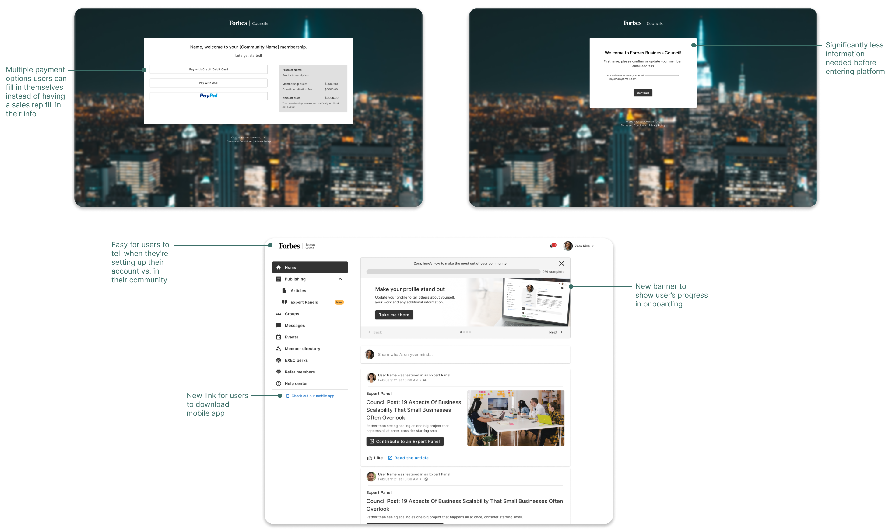
Wireframes went through several iterations. I started off with the payment userflow, showing how a new member would enter the site for the first time to submit their membership payment. I kept it short and sweet, trying to keep the pages as limited as possible. Then, after that flow was completed, users would be emailed a link for their account setup: this is where users confirmed their email address and entered their password. Lastly, I mocked up the in-platform flows. These included the new banner that directed users to various places around the site. We kept it to four steps: Publishing an Expert Panel (one of our main selling points), creating a new post, updating their profile, and the final optional step of downloading the mobile app.

We had a very low number of mobile users at the time, so this was also part of an initiative to boost mobile users. We added a link to the left navigation bar to prompt users to download the app if they hadn’t already.

Additionally, I mocked up the various tutorials around the site to illustrate how those would work for the members. I showed the targeted element, highlighting where the user should click, and then what happens when they interact. I did this for basically every page of the website, to depict how the Pendo alerts would work and how they would help the users on their first visit. I also included several links to our help center, in case users had questions afterwards.

Once the wireframes were in a good place, they were reviewed first by the internal team - product owners and engineers - and then, after a few edits here and there, we brought the designs to the stakeholders and larger team. A few iterations later and the designs were approved for prototyping.

Prototyping & Usability Tests
Creating prototypes for the onboarding process was basically making more pixel-perfect versions of the wireframes. It was a relatively straightforward process, as the wireframes were already quite detailed. However, throughout the process, we had a few edits and requests pop up as we continued to review and revise. Some of these edits included the aforementioned mobile adoption initiative - adding a link for the mobile app to the login screen, among some other small edits to our login flow - as well as a soft launch for badging.
Badging was a fun little exercise, as we wanted to give users a more game-ified experience to make their time as members more engaging and rewarding. Before, the only badges were in the groups and indicated if a user was the group leader. These badges only appeared on the groups page, but as member leaders were very proud of their titles, we spread the badge further across the site so other users would always know who was a community leader and who to reach out to for help, advice, or just for networking. Additionally, a new member badge was added so, for the first two weeks of membership, the user would be easily identified by their “new” indicator, which we hoped would prompt other users to reach out to the new people.
Lastly, I created prototypes for different screen sizes to make sure that users would be able to see these new additions on any device. Even though the majority of these flows were based in the web app, I made sure they were responsive so nothing would look broken or confusing if a user was accessing the links via their phone or tablet.
As with wireframing, these designs went through several iterations before approval by the greater team. However, we had the opportunity to show our new processes to a few users who had volunteered to give feedback, so we reached out and scheduled some user tests with the clickable prototypes I had created.
We started the user tests with three members for our first round. I wrote up several tasks for them to complete, as well as a few open ended intro and closing questions for them to answer: “What did you think?”, “What was challenging?”, “What was easy?”, etc. I tried to keep the questions as open as possible without guiding the interviewees to any certain answer. There were several tasks walking them through the payment flow, the account setup flow, and finally the in-platform progress flow, all using my clickable prototypes. With everything set up, I started the interviews.
Our first round went smoothly, and users provided a lot of great feedback. We gathered that the flows were, as we had aimed for, easy to use and quick. Users were not confused at all by the payment flows or account setups. However, they did run into a few snags during the in-platform section, finding some confusion with the banner especially. Users reported that it was “bland” and “didn’t attract enough attention”. With that in mind, and a few other small edits to make based on their feedback (such as rewording buttons), I gave the banner a makeover.
With the edits made, we had a second round of interviews. This round included three new members. We used the same questions and flows as the first, compiling their feedback into our figjam boards to easily see the conclusions. After the edits were made, users loved the new banner and all of the smaller issues that had been pointed out were no longer an issue.
Finally, with the users’ approval, the designs were completed. We had a final review with our stakeholders to make sure everyone on the team was synced on the final designs, and then it moved into development.

Final
Finally, the designs were updated and ready to view. Unfortunately, I left the company before I could see any of the analytics collected for these new features, but, if the user feedback from our testing sessions is indicative of anything, hopefully the users found the new designs clean, easy to use, and refreshing after such a long and tedious previous flow.